Microsoft Lists for iOS & Android
Driving design for Microsoft Lists on mobile devices.

Role & impact
- Managed the design team that builds Microsoft Lists for iOS and Android devices.
- Worked with Leadership and Product Management to define product vision and strategy
- Collaborated with Research, PM, and engineering to drive the product roadmap and ongoing development process
- Partnered with cross-functional teams such as Marketing, Content, Art Directors, etc. to contribute to the product charter
- Defined and delivered the end-to-end UX for a new 1.0 mobile solution, which was launched in Jan 2021
Work at Microsoft
At Microsoft, I design the OneDrive experience for Windows and macOS, and work on next-generation OneDrive and Copilot features focused on clarity, productivity, and product quality.
Over time, my work has spanned core collaboration and productivity experiences across the Microsoft 365 suite. This includes leading design for file-sharing and file-consumption experiences in Microsoft Teams, and shaping both consumer and enterprise versions of Microsoft Lists.
In earlier roles, I managed and mentored designers while remaining closely involved in product work, helping define direction and raise the bar on execution across web, desktop, and mobile experiences. I also designed OneDrive mobile experiences and modernized the SharePoint Metadata Admin Center (part of Microsoft Syntex).
Beyond product work, I led the Design Internship program and key University Recruitment initiatives, contributing to Microsoft India's design culture and long-term talent pipeline.
Microsoft Lists
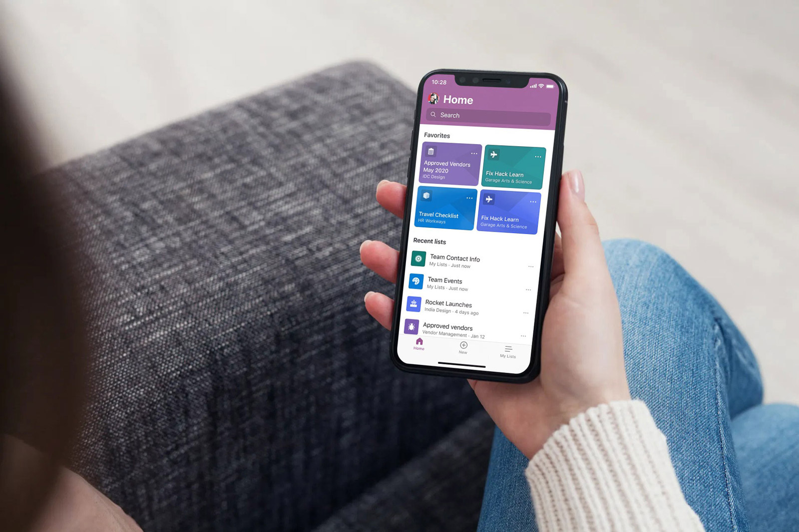
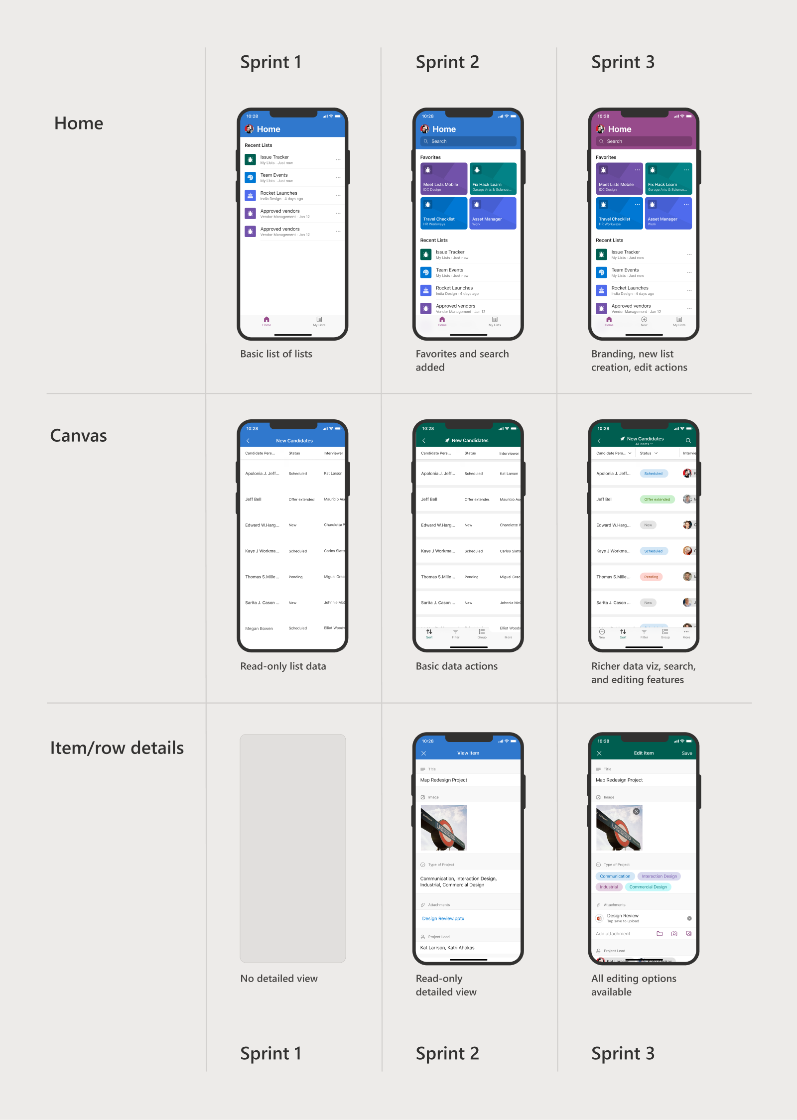
Lists is a smart information tracking app, that can be moulded into anything from a simple to do list to a complex inventory management system. In early 2020, we initiated work on the mobile app, which had a public release in Jan 2021.
As the Design Manager on the mobile app, I collaborated with PM, Engineering, and partners across our Hyderabad (India) and Redmond (USA) teams to define and drive the product strategy and development process.
At the beginning of the design process, I contributed to coming up with the initial pitch and the north star vision for the product experience. I, later, followed a research-first approach to chart the MVP and the release plan.
Related: Read about my work on building Microsoft Lists for web.
Why we built a mobile app
Microsoft Lists (erstwhile SharePoint Lists) is an established and heavily-used product on the web, with one of its earliest versions released in 2001. With a strong community and ecosystem, users have even built custom solutions based on the Lists framework.
However, the existing solution within the SharePoint mobile app was limited, and over time a need to address several new scenarios appeared.
We realized that a mobile-first solution with a simplified approach to information management will be the answer. The team, hence, set out to build a mobile app from the ground up, which gave us an open canvas to define the core experience and interactions of the product.
Designing the app experience
We had the challenge of building an app for a two-decade old product, and from scratch. I had a strong design experience of making the product for web, and I leveraged this to kickstart the process.
To begin with, we started with a blank slate (Figma pages, actually) to re-imagine the list experience. My team collected data and examined research from products in the Microsoft ecosystem to understand their approach to information management and productivity. This helped us create multiple hypotheses.
The first few weeks of the design phase, then, were spent exploring the possibilities of a mobile-first solution. I pushed the team to explore capabilities like GPS, accelerometer, camera, gestures, etc. to show how they could be used to create better solutions that fit our users' lives.
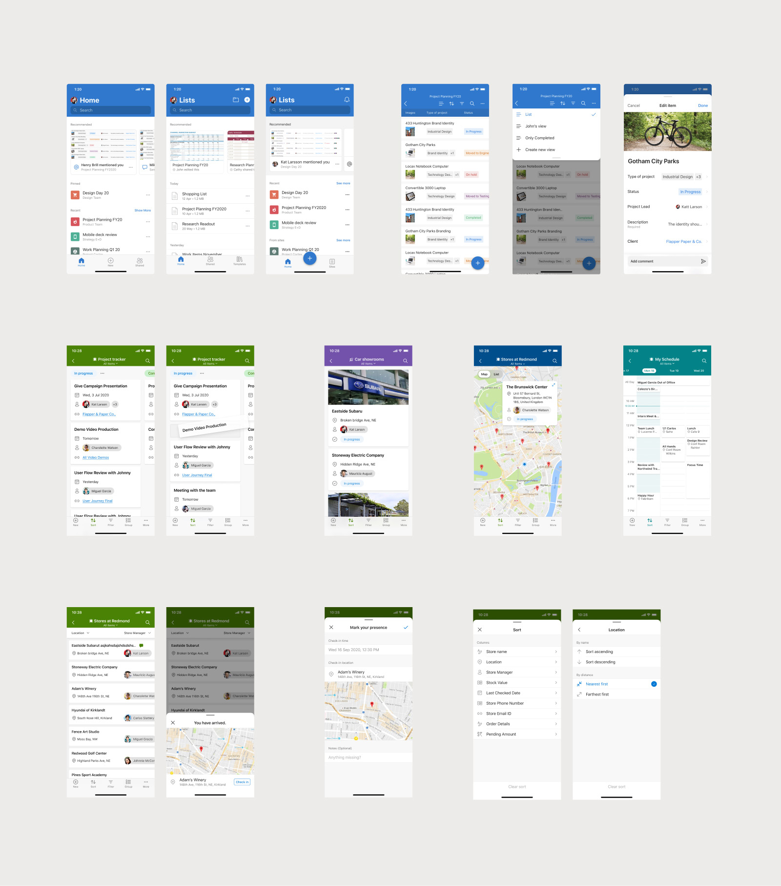
The primary and secondary research helped create multiple hypotheses for the product. Beyond that, I brought in insights from our web data and benchmark studies to drive many design decisions. These were the guiding principles for canvas interactions and feature discovery within the app. I enrolled the partner teams to use this knowledge for feature prioritization too.
I had a lot of fun innovating new ways of interacting with the data. For example, after many iterations we decided to anchor the first column in the list. This was necessary so that users don't lose track of the row they were looking at. The decision to make column sticky was a fine balance between the need for a large consumption canvas and reduced clutter in a content-heavy screen.
Below is the animation of how the text sticks to top as the user begins to scroll.
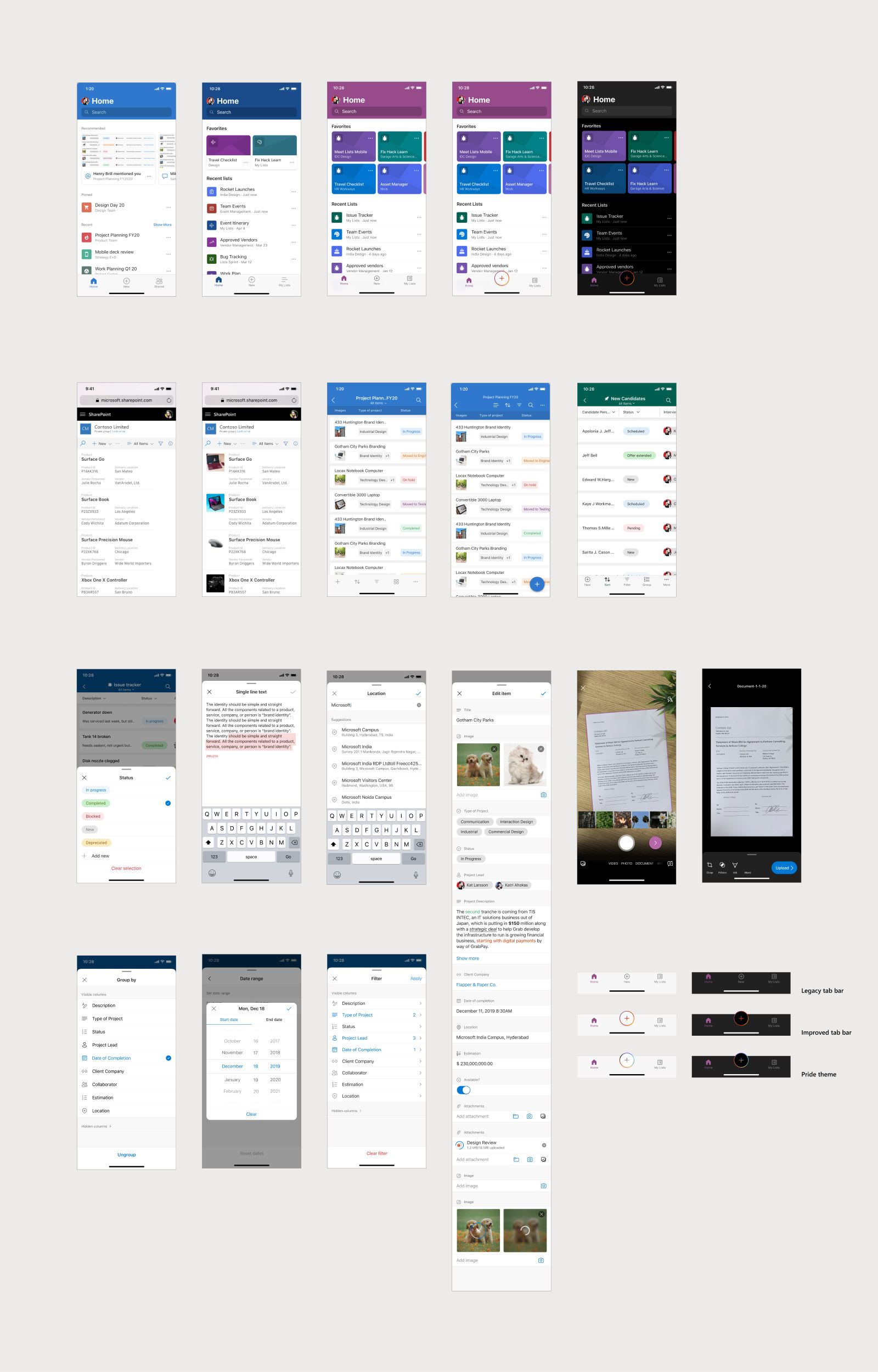
Most of the app was designed and built while we worked remotely. As the Manager, I tweaked our processes to make our design crits and peer reviews with our teams in India and Redmond more efficient and productive. This helped to expedite decision-making and reduced blockers for Engineering.
Further, we collaborated closely with the Fluent Design team to align with Microsoft Design principles and coherence with other Microsoft products.
To deliver value with every sprint release, I worked with PM and Engineering to create a sprint plan with 'user value' as an important factor. With this, the app was usable and our users found value with every internal dogfood release.
The product was now ready for an amazing public release.
App store and content strategy
With a new product offering, landing the right messaging and branding on the app stores was very important.
Microsoft was in the middle of revamping the design aesthetic of its app store content. I made sure the team plugged in to this effort in advance, to have the visual language in alignment with our product ethos. I worked with Art Directors in the Microsoft Brand team to define the messaging that portrayed the product the best.
I conducted reviews with key stakeholders to close on the strategy. Meanwhile, I worked with the marketing teams and content writers to use the current market research and Microsoft principles to come up with a copy that complemented the imagery.
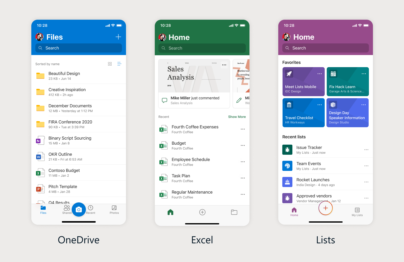
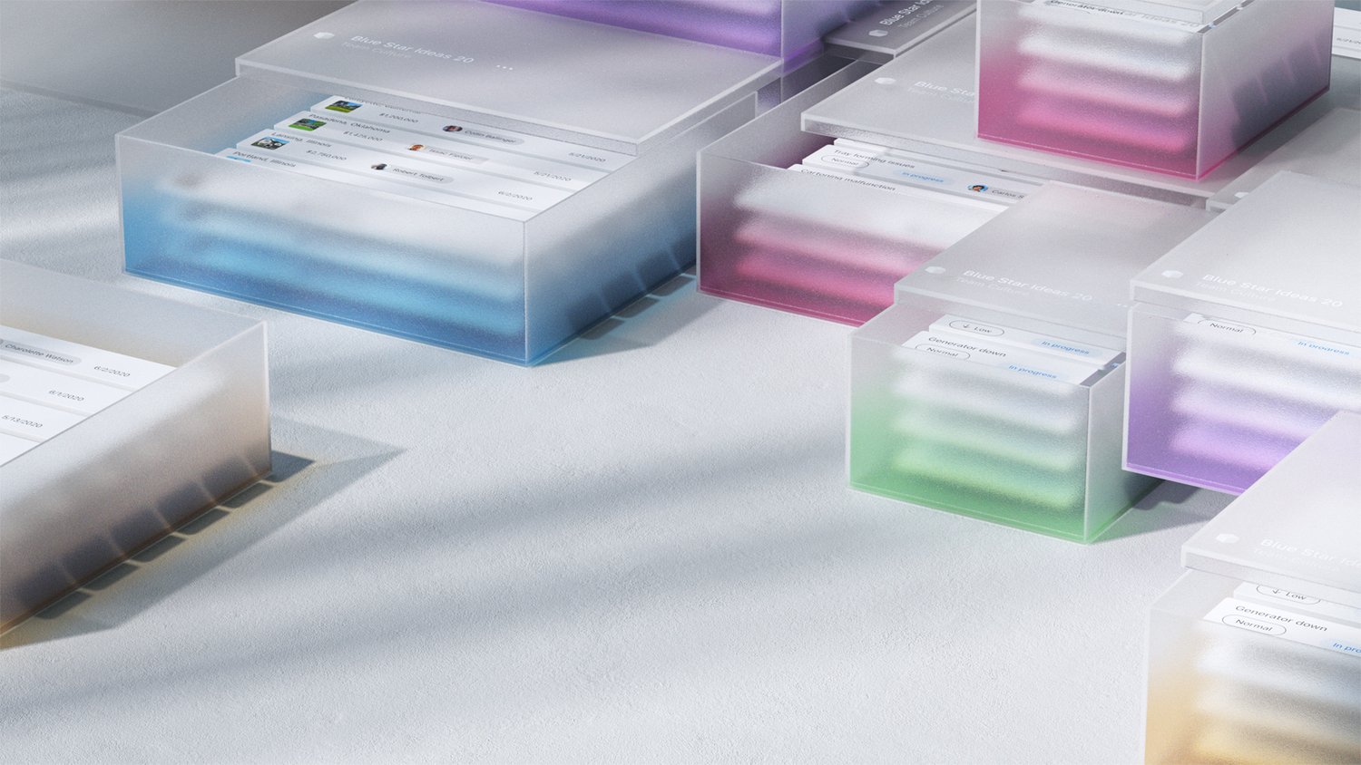
We decided to represent the product by illustrating the essence of the product experience. Lists is an app to organize and track work, and we used bold and colourful branding to represent this through tinted boxes and stacks. Elements of collaboration capabilities were sprinkled across the artwork.
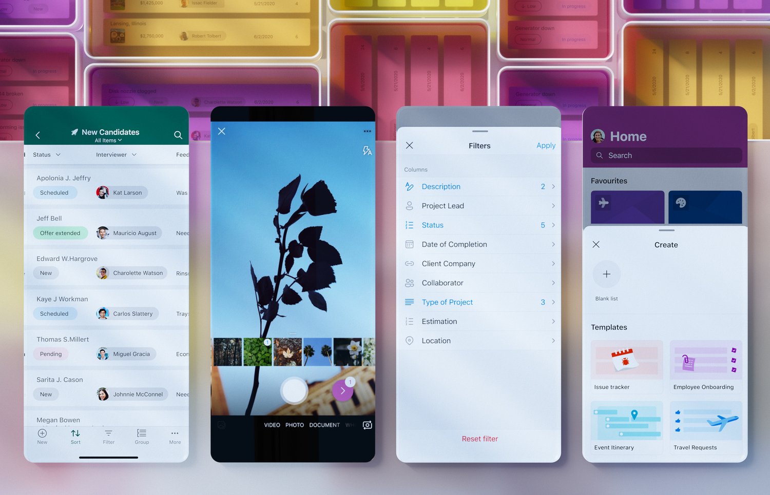
Before the final release, we designed and tested multiple iterations of the assets and the app store copy with users.
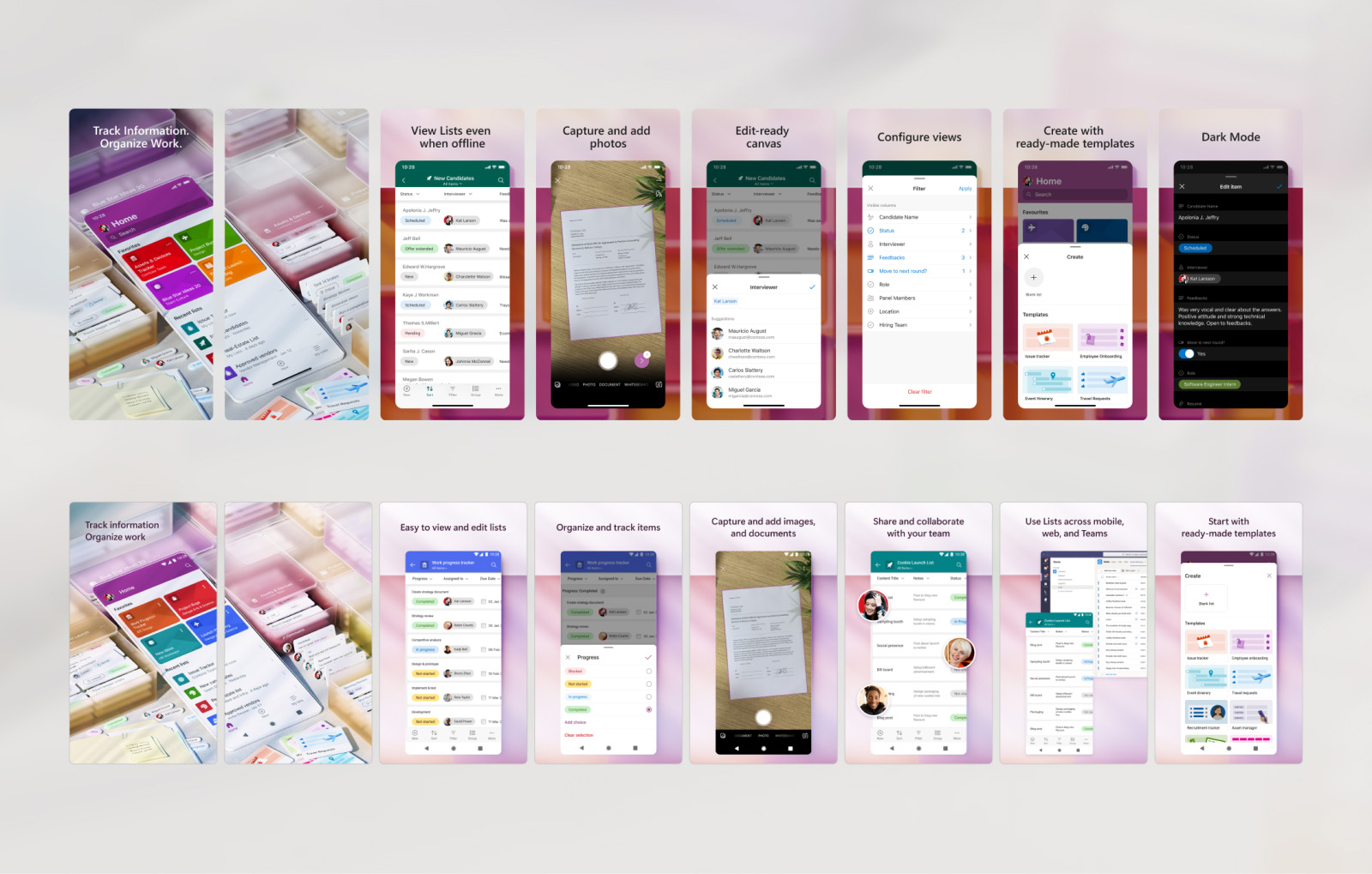
Over time, I have continued to work closely with the marketing team to fine tune our positioning on the app store. We have been making incremental changes to the copy and the images to communicate the right product value to our users.
Below is the comparison of our versions over time, where I used this data to refresh the renders to bring more focus to the subject. The ordering and value props were also modified to align with a typical user journey.
Continuing work
The apps are in rapid development, and my work includes working on identifying opportunity areas, organizing crits, standardizing internal processes, developing design frameworks, and enhancements based on user feedback, besides delivering for the existing roadmap.
I continue to collaborate with Research, PM, Leadership, and partner teams to draft the product direction. I also engage in research to better understand jobs to be done, and identify the right problems to solve.
Below is an example, where I used feedback to improve the default column widths and built a feature to customize it. We continue to monitor telemetry to find patterns that may be shipped as OOTB features in the product.
Learnings
- As a Design Manager, this has been a process of learning and refining my abilities in leadership, collaboration, and people management.
- To drive the 1.0 product direction, I used data from our web property to piggyback and drive our key UX decisions. This helped to quickly make and validate multiple hypotheses.
- Design explorations and storytelling played powerful role in communicating points of views and UX intent. We used these to create excitement for the product direction.
- I used user scenarios to prioritize and plan features. This helped deliver a holistic solution at the end of each development cycle.
- Craftsmanship has been one of my key focus areas. I took up initiatives to drive clarity in intent and to develop an appreciation for craft within the partner teams.