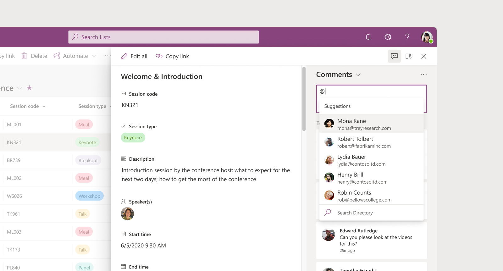
Microsoft Lists for Web
Leading design for consumer and enterprise features for Lists on web.
Role & Impact
- Managed a design team for Microsoft Lists in the areas of views, visualization, and formatting experiences for the web
- Worked closely with PM and Engineering to create and drive the product strategy
- Designed modern experiences to elevate Microsoft Lists as an independent product in the M365 suite, for enterprises and consumers.
- Built and shipped several low-code & no-code features for Lists
- Delivered a high-quality product through a continuous focus on craftsmanship and accessibility
Work at Microsoft
At Microsoft, I design the OneDrive experience for Windows and macOS, and work on next-generation OneDrive and Copilot features focused on clarity, productivity, and product quality.
Over time, my work has spanned core collaboration and productivity experiences across the Microsoft 365 suite. This includes leading design for file-sharing and file-consumption experiences in Microsoft Teams, and shaping both consumer and enterprise versions of Microsoft Lists.
In earlier roles, I managed and mentored designers while remaining closely involved in product work, helping define direction and raise the bar on execution across web, desktop, and mobile experiences. I also designed OneDrive mobile experiences and modernized the SharePoint Metadata Admin Center (part of Microsoft Syntex).
Beyond product work, I led the Design Internship program and key University Recruitment initiatives, contributing to Microsoft India's design culture and long-term talent pipeline.
Microsoft Lists for web
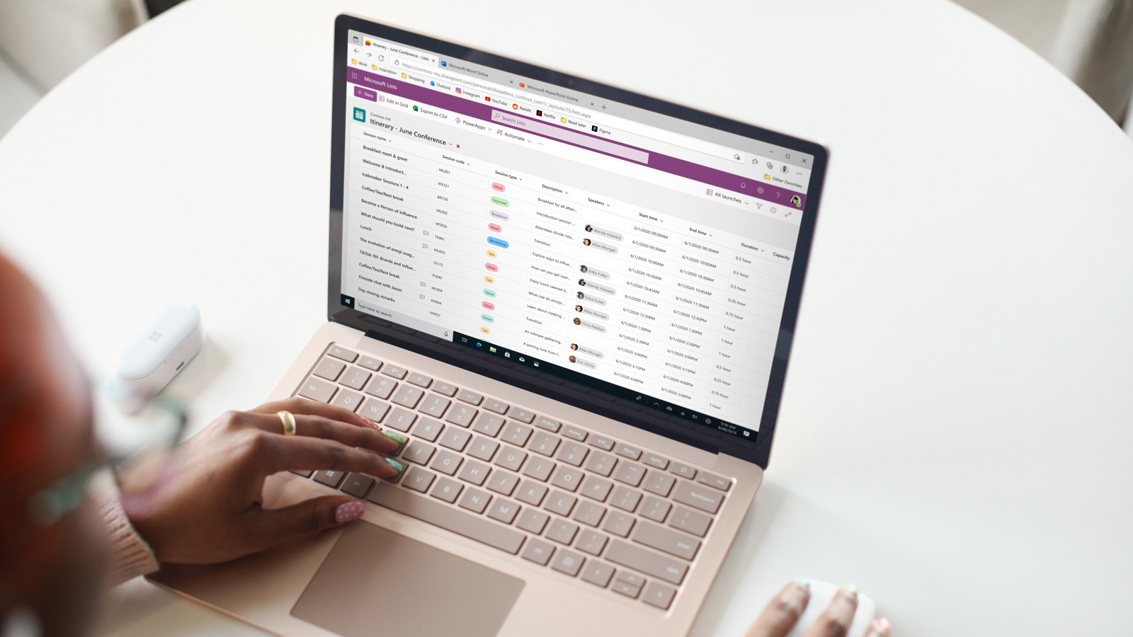
Microsoft Lists is a smart information tracking app, that can be moulded into anything from a simple to do list to a complex inventory management system. The product has a tremendous usage and has existed within SharePoint in some form since 2001.
My focus as the Lead Designer on the product was designing new list visualizations, building formatting features, and driving the product charter. I joined the team, when it was just set up in India and I, as a designer, was responsible to build credibility and be accountable to our global objectives. I started as an individual contributor on this product area, and later transitioned to the role of a Design Manager.
Today, our team drives several key areas that have a direct impact on the 190M SharePoint users.
Related: Read about me building Microsoft Lists for iOS and Android.
Improving UX Fundamentals
When I joined the team, it was early days of modernizing the product, and we were finding avenues to make the product better. After listening to users and looking at feedback, I proposed that we should focus on improving the fundamental user experience.
For example, the action to create a new column in a list was buried deep, and was missed by many users. I designed a simpler way and made it contextual, so that users can find it easily and complete the task quickly. I did a similar exercise with column reordering, where users could just drag columns and drop anywhere on the canvas.
These changes and upgraded experiences helped drive more engagement and contributed to the overall user retention in the product.
Low-code and no-code experiences
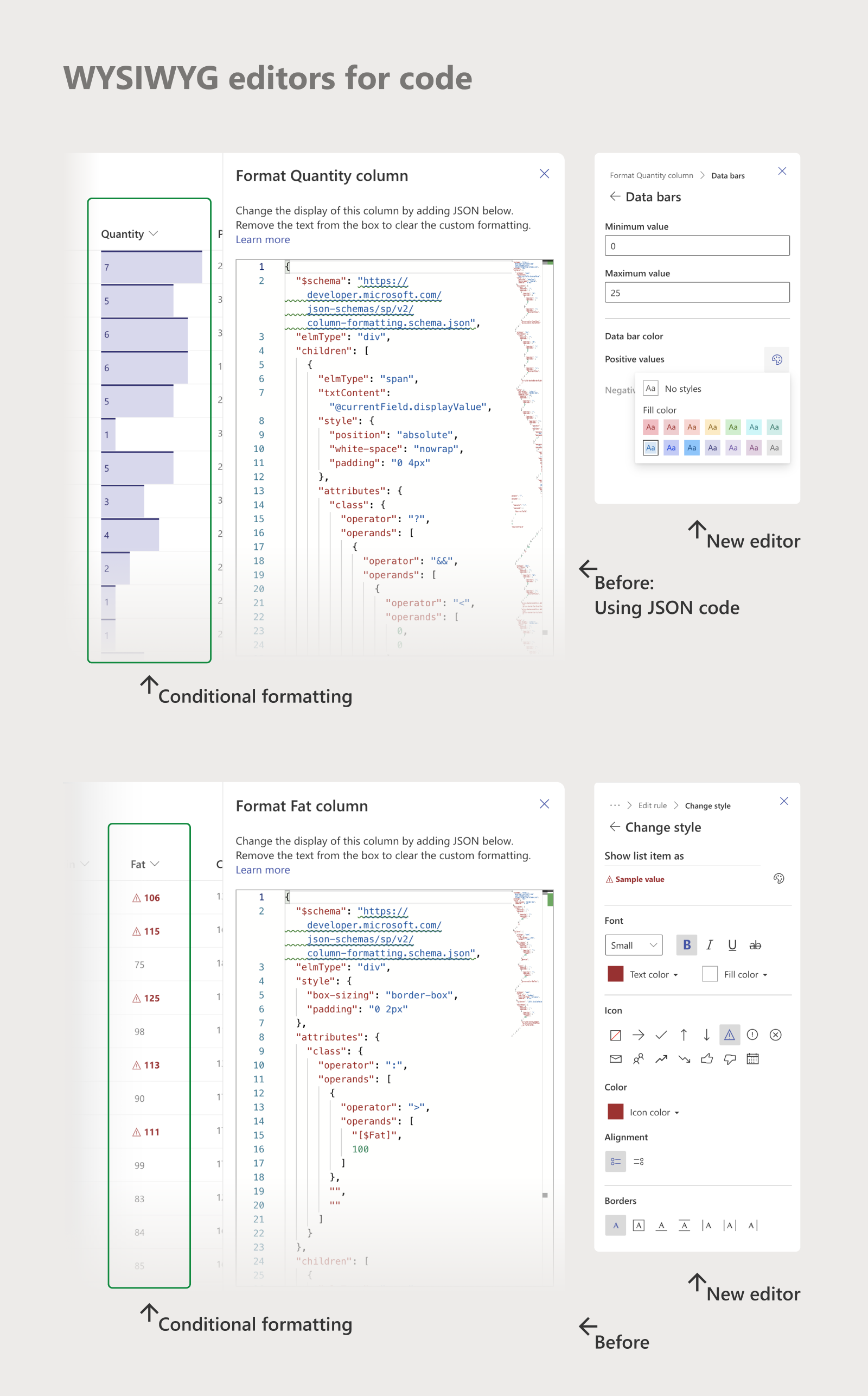
Lists had a vanilla way to display data. New JSON code-based features helped users to highlight content and find data easily, but this was rarely being used by novice users.
I believed that making this feature easier to onboard will drive engagement. So, I built easy-to-use templates where, users could achieve with just a few clicks, what they did in JSON by writing several lines of code. This feature was loved by users. I made sure there was an interop between the templates and code, so that users can bootstrap on the WYSYWIG templates to write custom code.
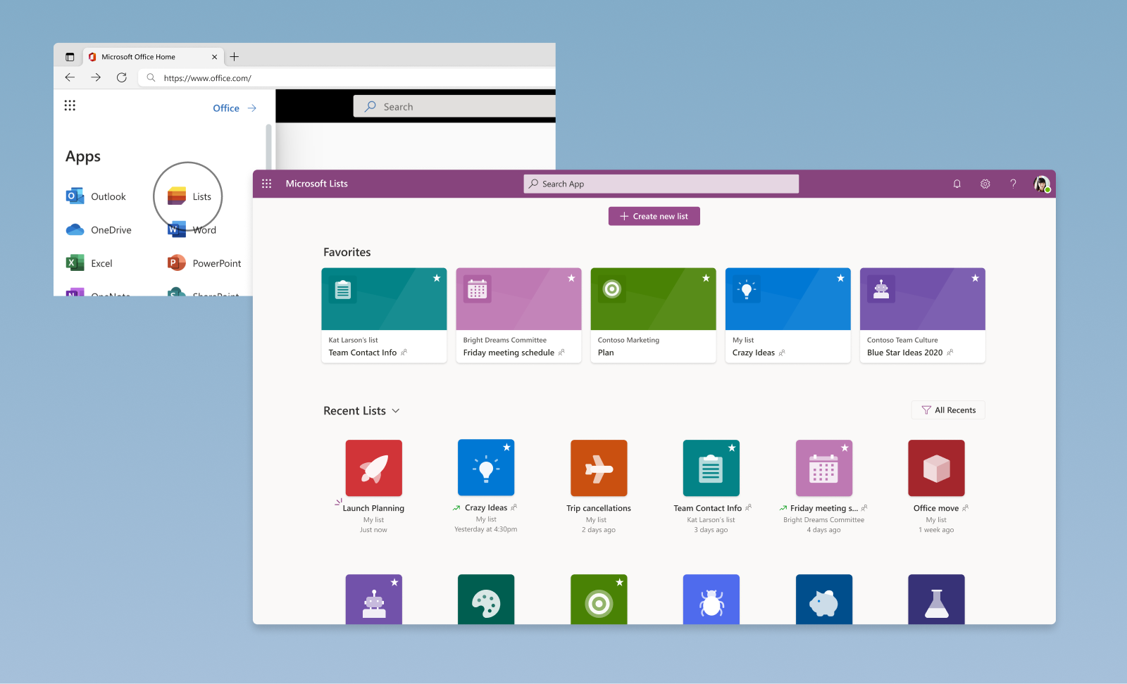
Elevating Microsoft Lists
In 2021, we launched a brand-new avatar of SharePoint Lists as Microsoft Lists. The product now elevated in the Microsoft 365 suite and surfaced in the Office.com App launcher, creating a new funnel and a faster path to reach the product.
We used benchmark studies and continuous engagement with our users to improve the fundamental experience of the product. I engaged the team in multiple review sessions to overhaul and polish the experience to meet the new bar we had set.
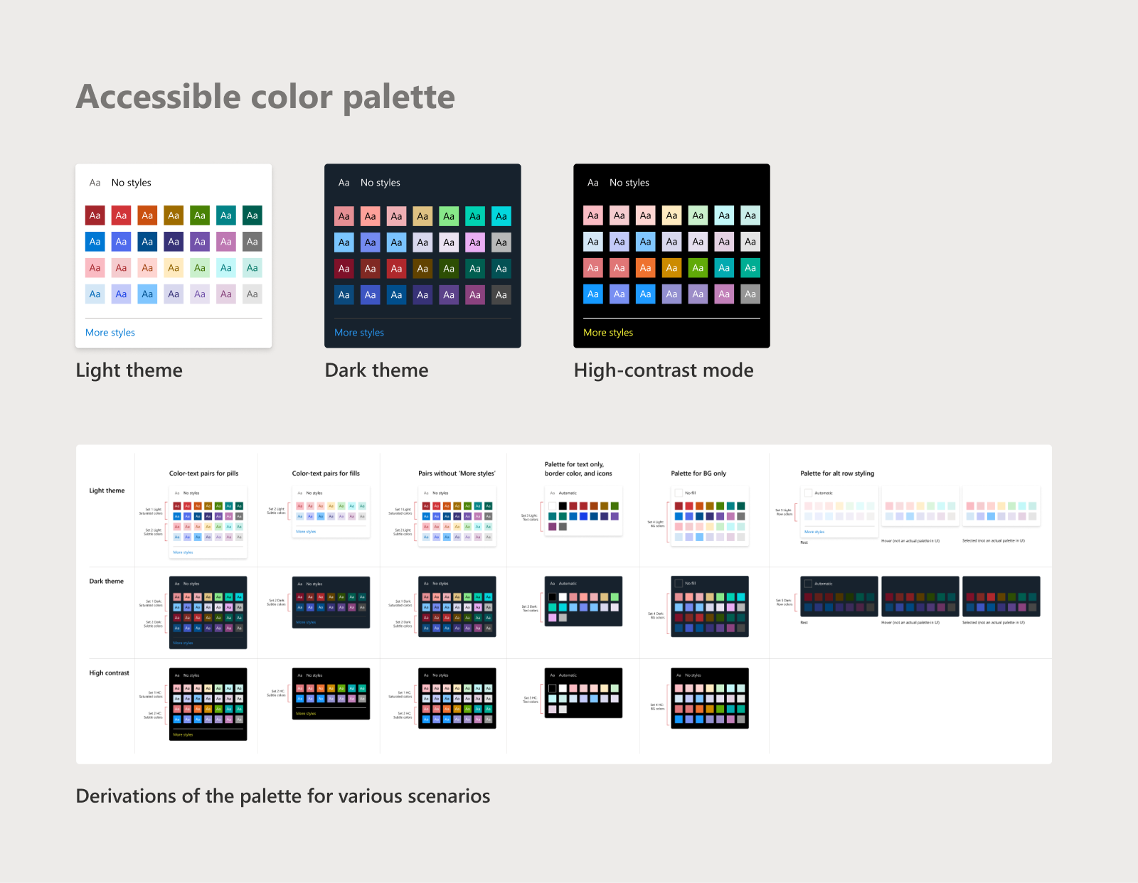
I worked with partner teams to create the new design framework, accessible colour palettes, and theming for the product. I spent a lot of time ensuring that the features I designed worked in various contexts and in first-party integration scenarios in Teams.
As part of this, we introduced collaboration features similar to other Microsoft Office products. My major contribution here was to align various design stakeholders from different teams on the visual design and interaction of the feature. This ensured minimal dependencies and faster ship times.
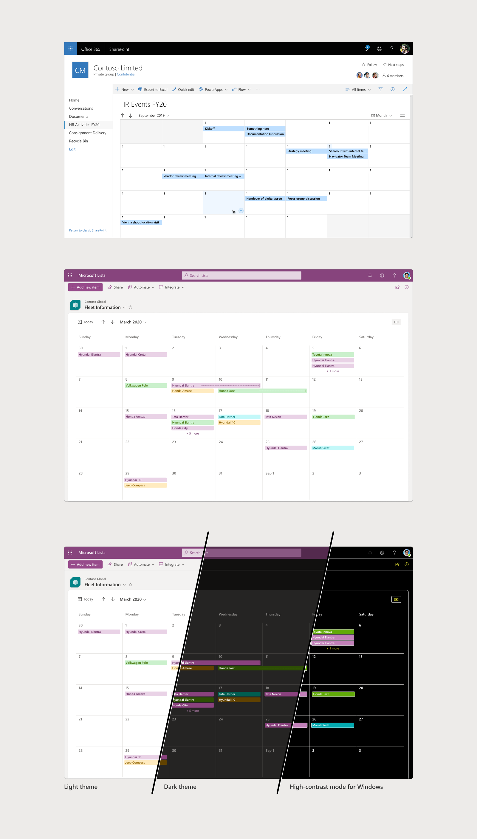
New views and visualization
Lists is a horizontal product and serves a varied number of scenarios and verticals. For many users, views form an important part of their business workflows and collaboration.
I have worked on creating many new and novel visualizations for list data over the years. One of the key problems I solved here was aligning the new UX with existing mental models of users. I have always had a high focus on craft and accessibility, and worked with Engineering to calibrate the processes to achieve this.
Gallery view
This was one of the earliest views I designed, and it was valuable collaborating with designers from Microsoft Excel, Bing, and SharePoint to understand different card frameworks and defining a new one for Lists. Beyond the view, the UX I made also has a card designer which gives users control to customize their cards.
Calendar view
One of my major features was the Calendar view for users with scenarios for event management and scheduling. I worked closely with the Outlook and Teams team to better understand user behaviour in a calendar and designed an experience that worked for List users. I reused many existing and familiar UX patterns from other Microsoft products, to help users onboard easily to the new experience.
Board view
Board is the latest view, I designed, that caters to quick project and task management. One of my main challenges here was mapping the List mental model to a Board. The feature underwent multiple user testing cycles and I worked on simplifying the content copy to be closer to user expectations. I worked with PM & Engineering to come up with the MVP strategy, where we used user jobs as the criteria to prioritize features.
Learnings
- Product development in enterprises can be a time-taking process, and it is necessary to ensure a high-quality bar when building for millions of users
- As a design owner, I am accountable for driving the cause of good UX and I could achieve this only through tight collaboration with partner teams
- Craftsmanship needs a methodical approach and as a Lead, I did the necessary tweaks in the product development process to ensure a high quality bar
- Telling right stories through prototypes or POCs is very important for buy-ins from the right stakeholders
- Building accessibility right could take more time than the feature itself. I learnt this while designing a11y and keyboard navigation for features in Lists.