SharePoint Managed-metadata UX
Story of re-designing for SharePoint taxonomy services.
Role & Impact
- Designed the new admin system for SharePoint metadata and taxonomy services
- Worked with multiple teams to align with the global vision and design language of Microsoft Admin centre
- Designed several new UX and interaction patterns that are now used across multiple Microsoft admin systems
- Built and standardized components for Fluent Design system
Work at Microsoft
At Microsoft, I design the OneDrive experience for Windows and macOS, and work on next-generation OneDrive and Copilot features focused on clarity, productivity, and product quality.
Over time, my work has spanned core collaboration and productivity experiences across the Microsoft 365 suite. This includes leading design for file-sharing and file-consumption experiences in Microsoft Teams, and shaping both consumer and enterprise versions of Microsoft Lists.
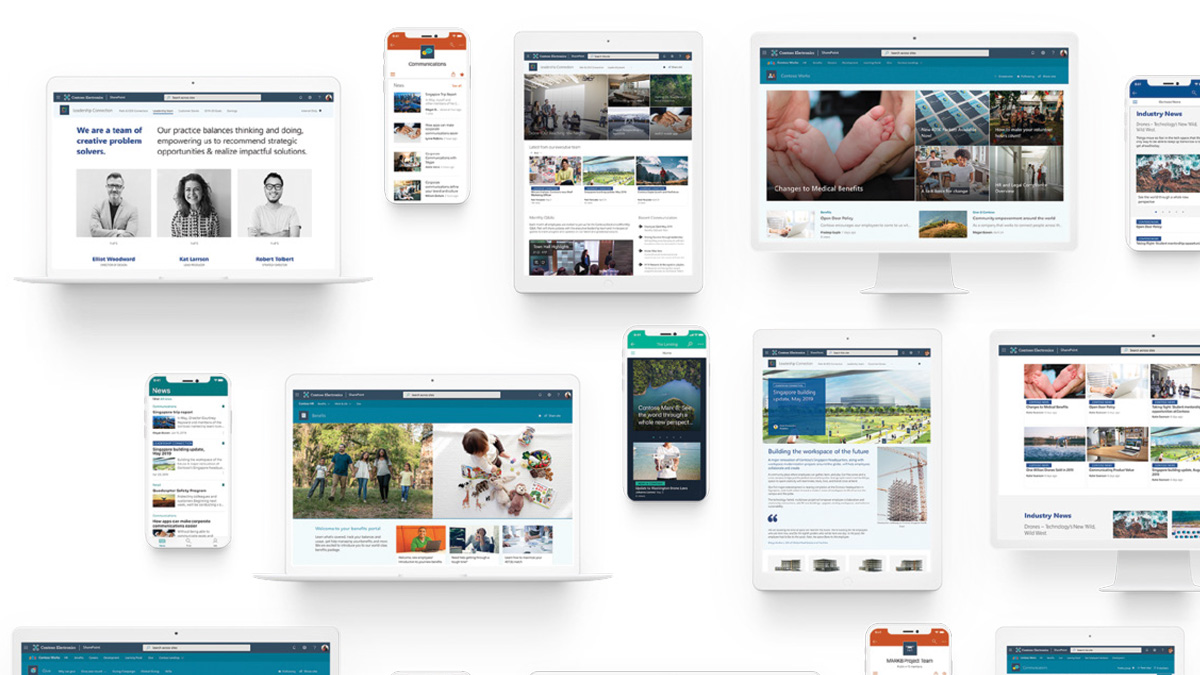
In earlier roles, I managed and mentored designers while remaining closely involved in product work, helping define direction and raise the bar on execution across web, desktop, and mobile experiences. I also designed OneDrive mobile experiences and modernized the SharePoint Metadata Admin Center (part of Microsoft Syntex).
Beyond product work, I led the Design Internship program and key University Recruitment initiatives, contributing to Microsoft India's design culture and long-term talent pipeline.
Related: My work on building Microsoft Lists for web and for mobile devices.
SharePoint taxonomy services
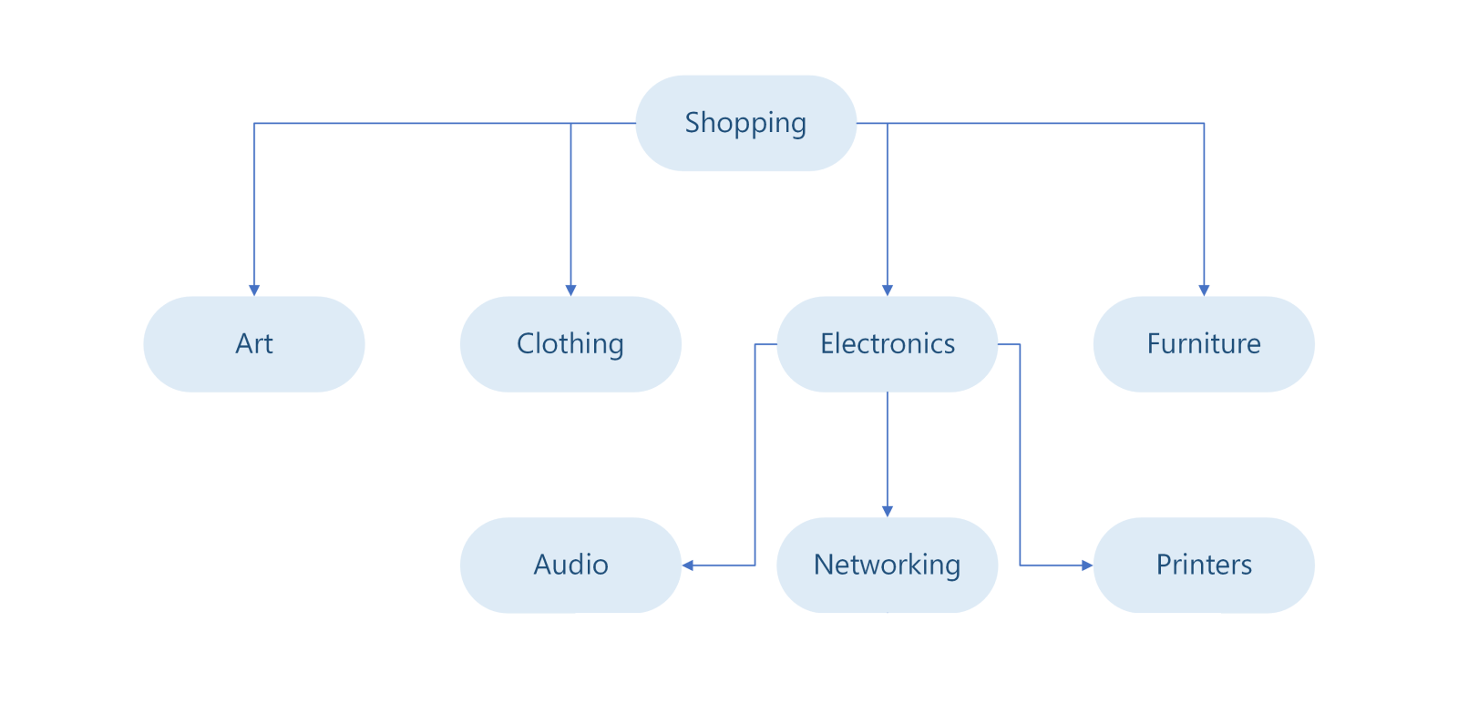
A taxonomy is a formal classification system. A taxonomy groups the words, labels, and terms that describe something, and then arranges the groups into a hierarchy.
Organizations manage their taxonomies and metadata centrally, using SharePoint. This helps them to organize, search, and handle information easily, and often for compliance, and data intelligence purposes.
My role as the Lead Designer on this product was to design interactions for navigating hierarchical content, and to lead the redesign effort for the existing admin system.
Designing a better 'tree'
This was one of the seemingly simple, but intricate features I ever worked on. I closely experienced that achieving simplicity in design is hard work.
The first task in this initiative was to redesign the taxonomy navigation experience for end-users of SharePoint. The current system used a tree in a classic mode, and I set out to invent a new design paradigm. For this, I came up with multiple options, and after various reviews, we took two of them to the users to test them.
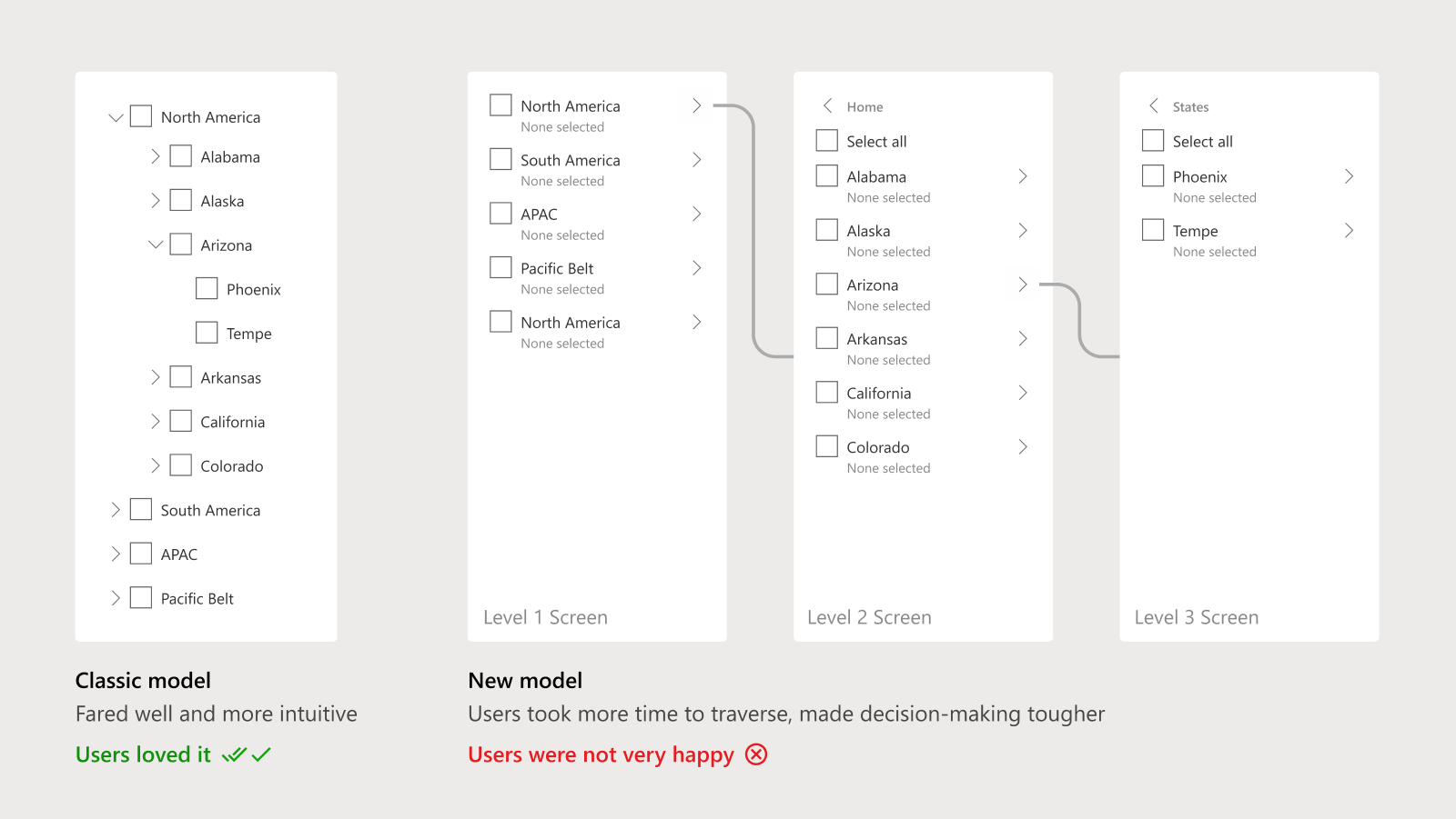
The research output was intriguing. The new design didn't make the cut; the classic model fared very well. The new design resulted in longer time to complete the intended tasks as it made decision-making complex. With more insights from the data, I decided not to deviate from the classic model and set out to solve the rest of the problems and requirements based on that design.
There were several requirements and features, and the challenge was to create a robust tree structure that would not be too distant from the original classic design in terms of experience. Due to practical challenges like page load times and scalability, this was a better choice to proceed with too.
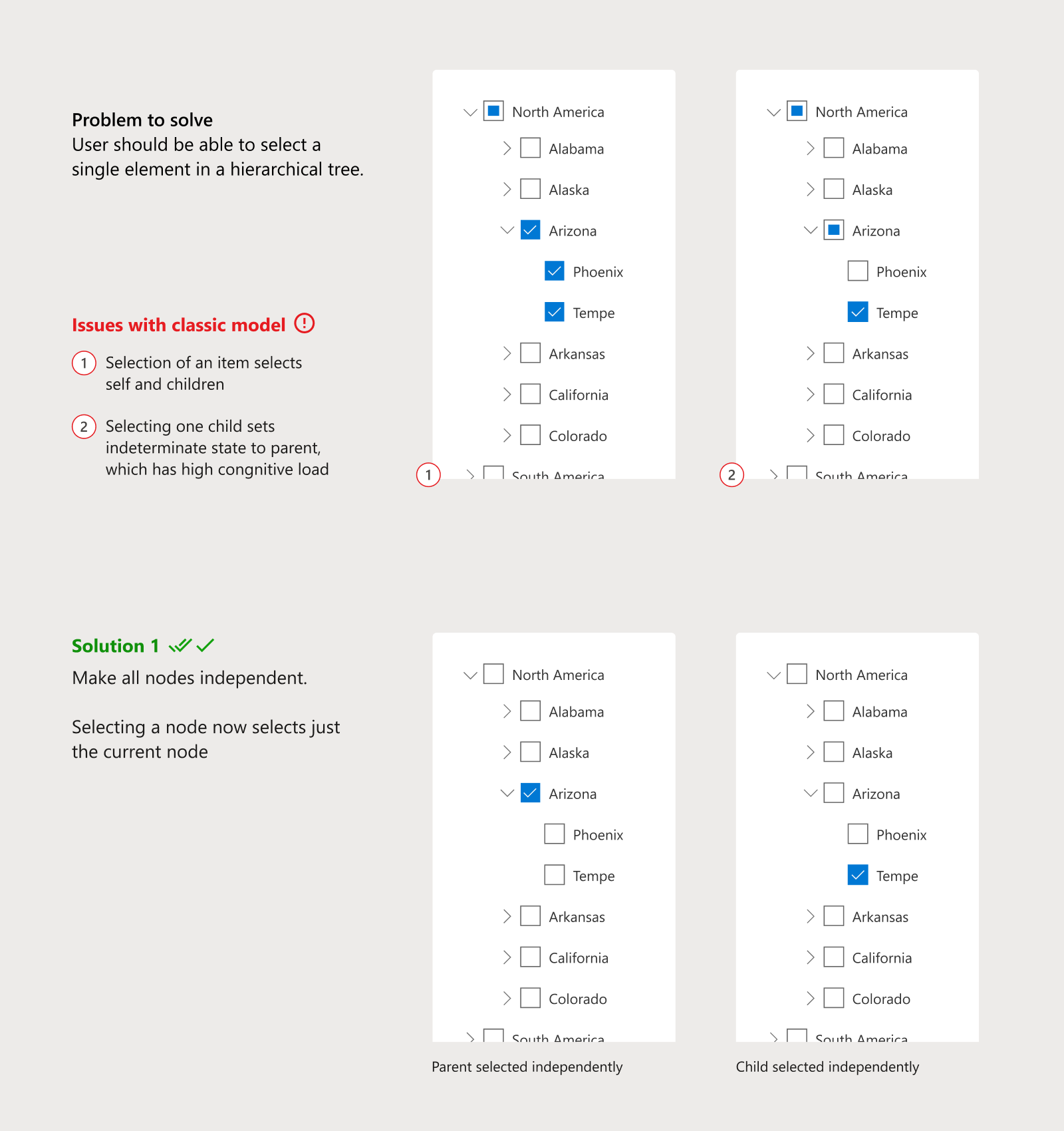
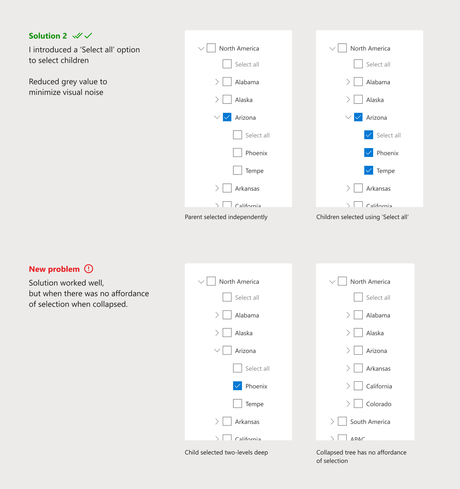
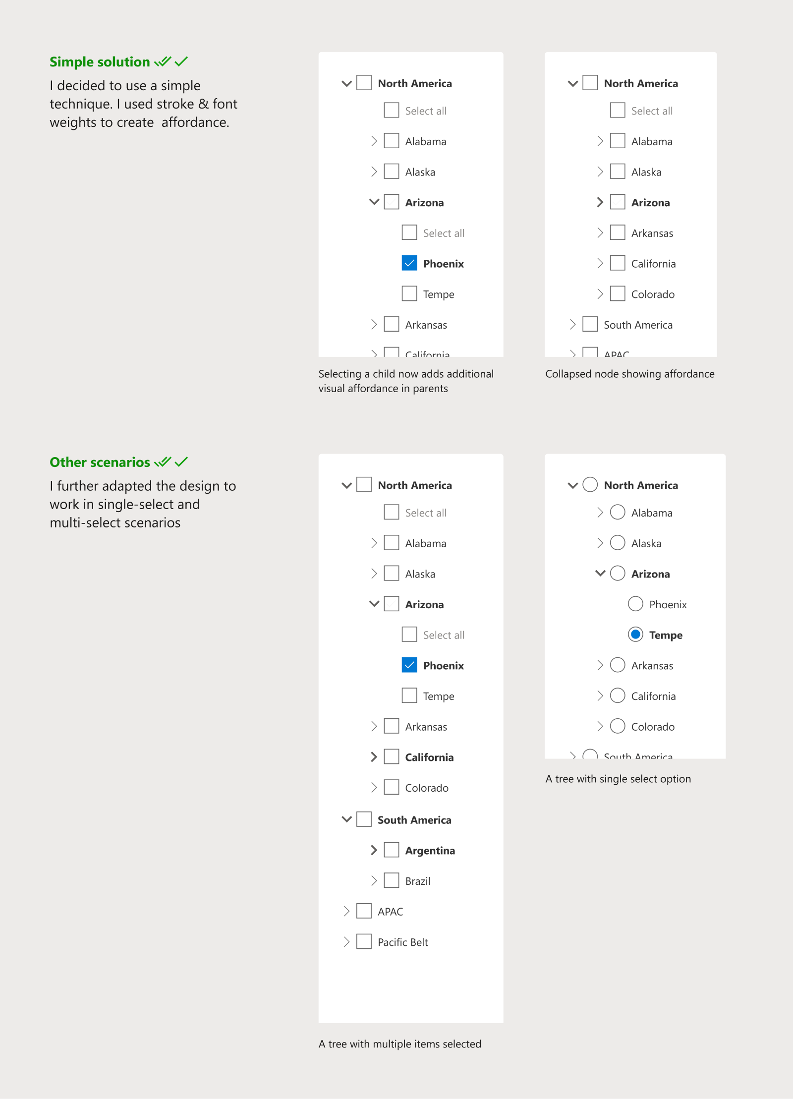
The robust tree was now ready. I added further interactions to add items and to show descriptions contextually. We went ahead and standardized it, so that it can be reused across the product as a standard control.
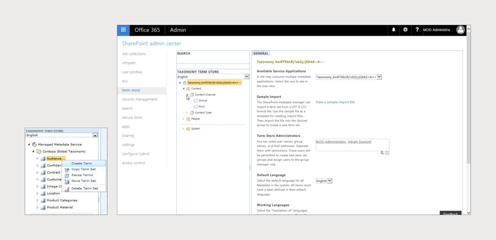
Designing the tree for admin scenarios
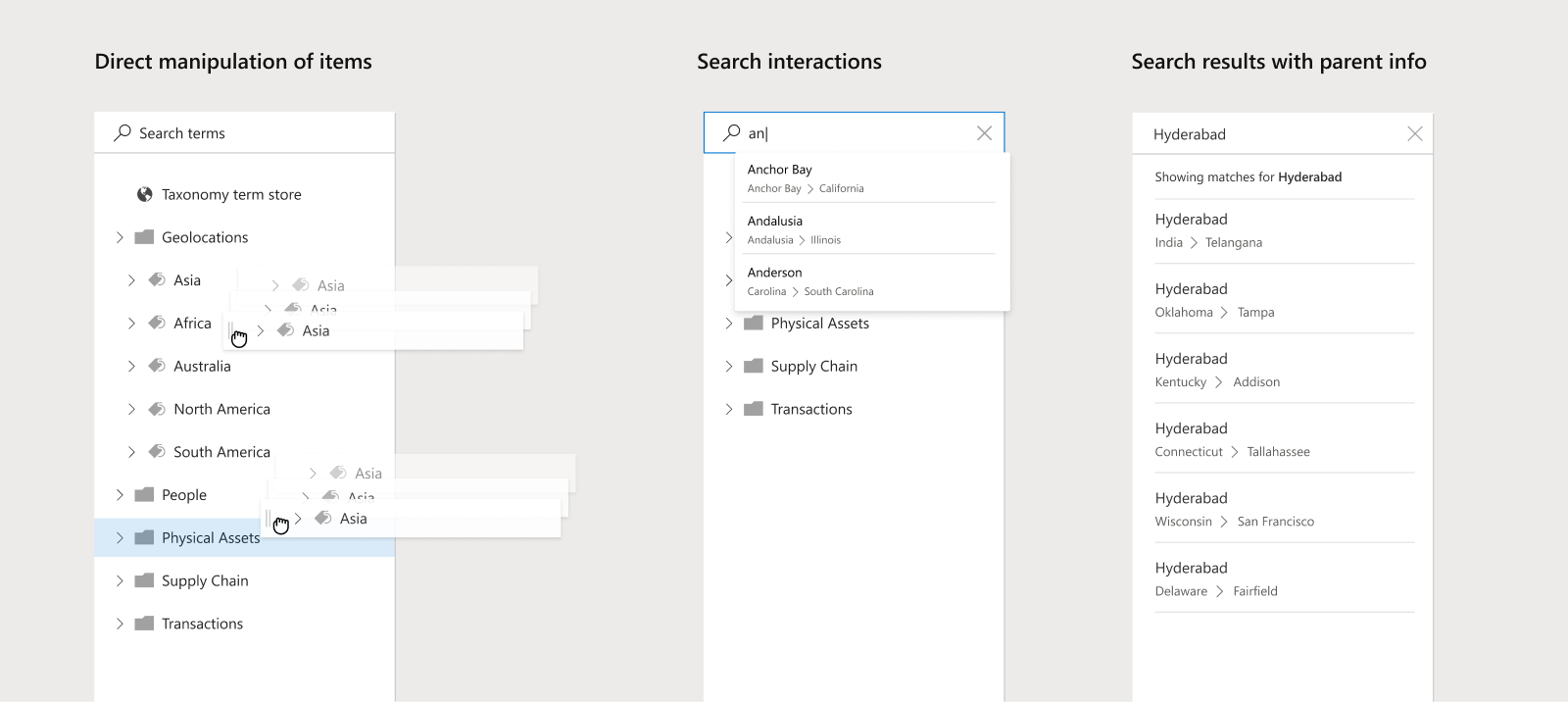
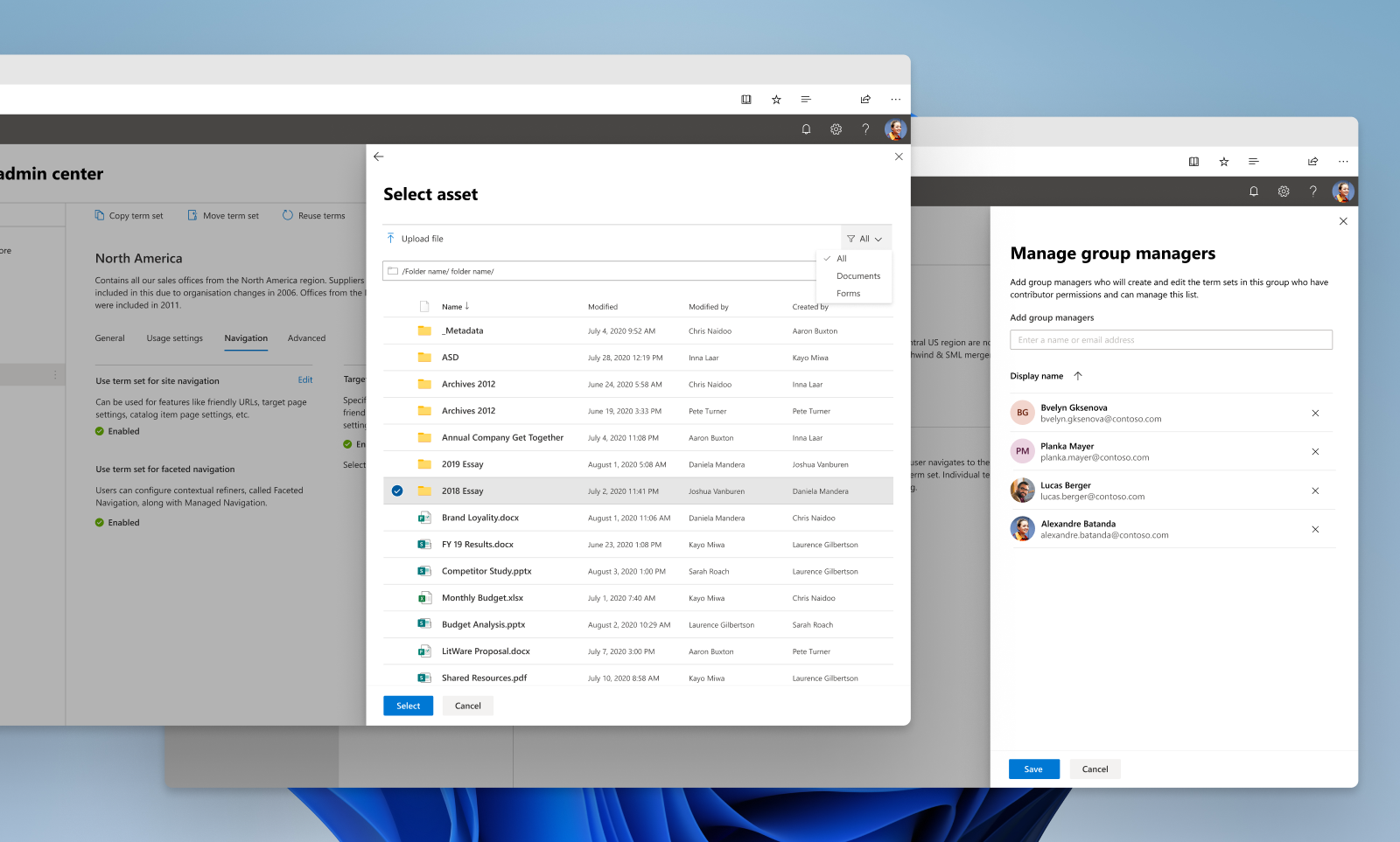
The second part of the project was designing the admin & management system for taxonomy. This required modifying the tree created so far to include additional actions, like search and manipulation. I had to ensure that the design is scalable enough to absorb new features without deviating too much from the original form.
Scalability of UI was a major factor in several design decisions. For example, what would the behaviour of a tree with 10,000 items be? How would we gracefully degrade such an experience? How would users access an item that is 10 levels deep?
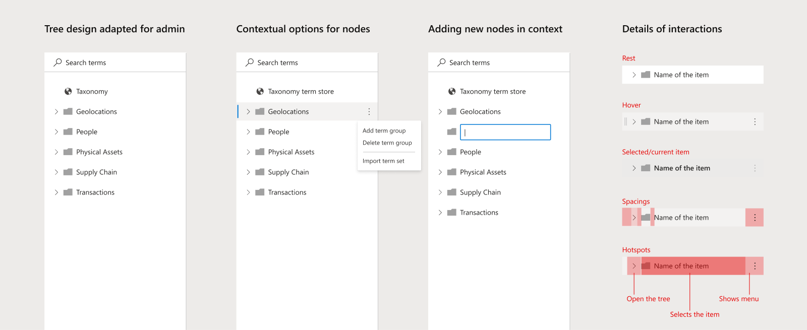
During this, I worked with several teams globally to design and standardize the tree structure and it's interaction patterns for Microsoft admin centres.
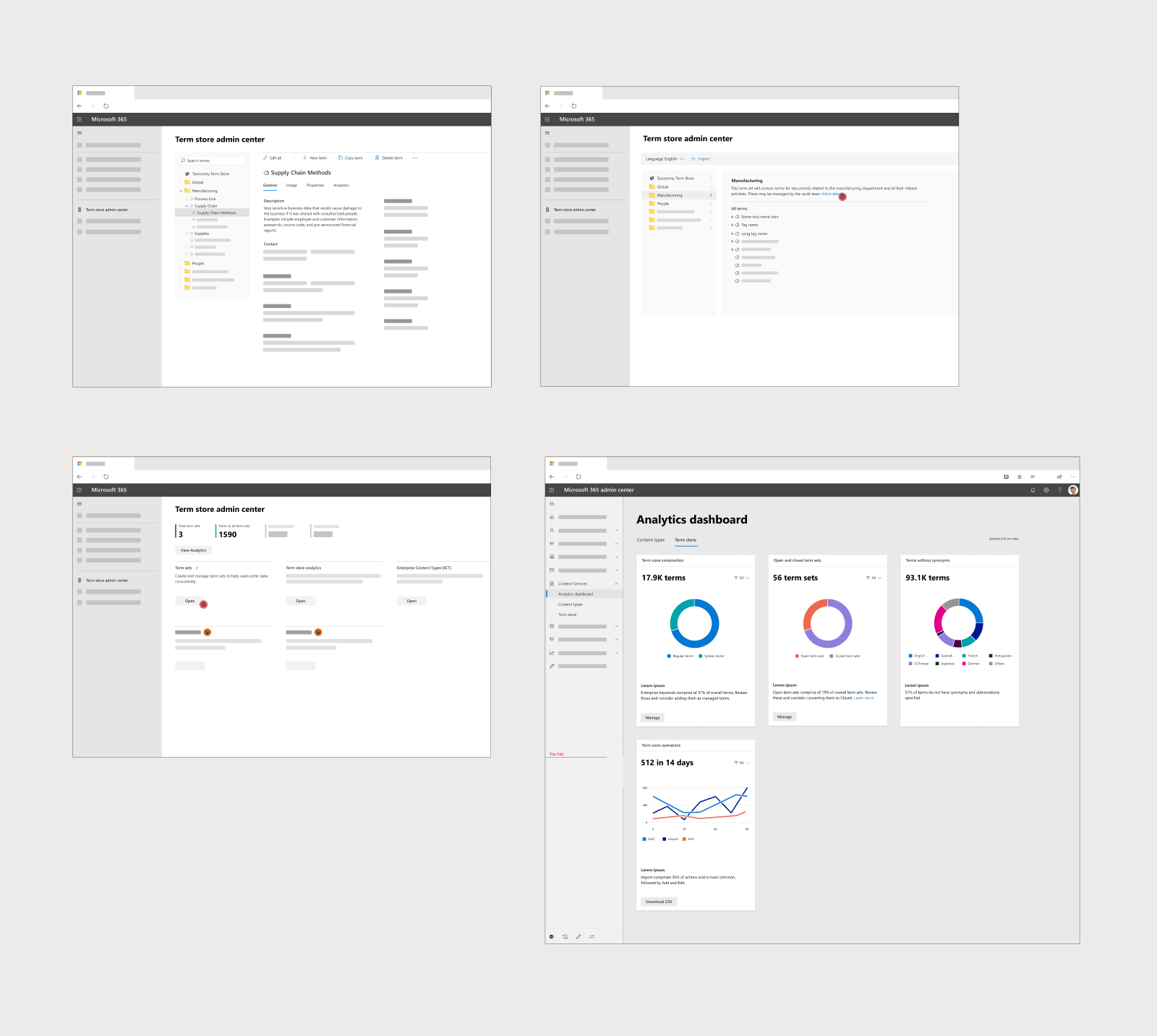
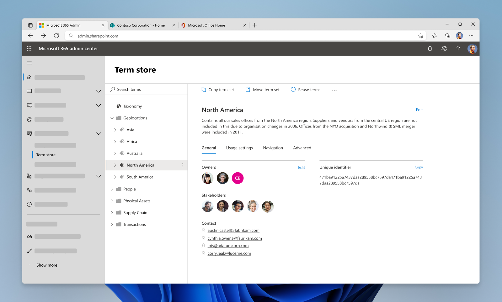
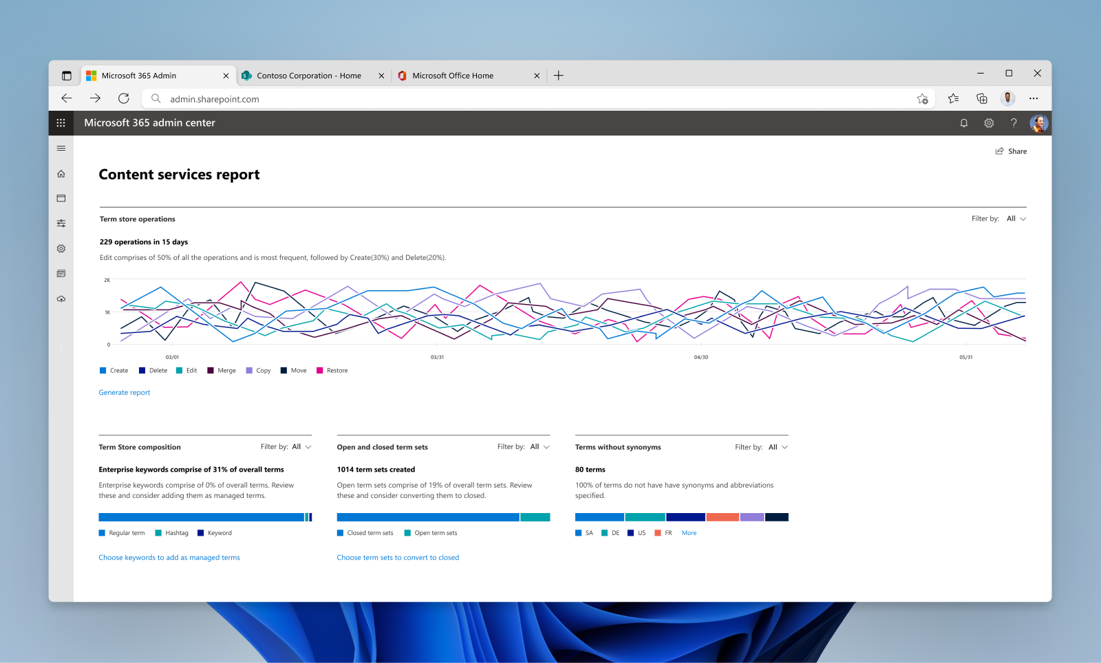
Managed-metadata admin system
The final leg of the project was designing the metadata and taxonomy admin system within the SharePoint admin centre. The existing system was built long back and there was a need to modernize it, and align it with the modern design language of Microsoft Admin centre.
One of the major challenges when I started was to understand the complex system and the domain. I worked in close collaboration with the Engineering team, as a lot of scenarios were driven by technology. I interacted with several users to understand their jobs and challenges better; it also helped in prioritizing our feature roadmap.
I worked closely with PM and Engineering to chart the product development plan and to conceptualize newer offerings like the analytics dashboard. The dashboard utilized massive telemetry data to show usage patterns and intelligence. Further, I collaborated with the central Microsoft Admin centre team to align my work with the overall vision and design language.
I even made an early POC to visualize the taxonomy telemetry data using Microsoft PowerBI tools, long before the initiation of this project. For this, I won an internal Hackathon award. 🏆
Learnings
- Partnering with global teams taught me that such collaboration is necessary to understand diverse scenarios and needs, while building UX frameworks.
- I had tremendous learning on the process and collaboration front, while driving the design strategy for legacy and engineering-heavy design project.
- Achieving simplicity in a UI and interaction pattern is complex work, which I realized while designing the hierarchical tree navigation.
- I learnt that early alignment with Engineering is critical for tech-driven areas.
- It is not always necessary to invent new interaction patterns. Building on existing patterns helps in quicker alignment with users mental models.